Matrix Analyzer
Welcome to the Synaptic Physiology Matrix Analyzer. This interactive tool will allow you to explore the Synaptic Physiology Dataset.
Getting Started
Follow the instructions to setup an Anaconda environment found here.
Once you have your environment created, open an Anaconda prompt and activate the environment:
conda activate aisynphys
Run the Matrix Analyzer in an Anaconda prompt:
cd aisynphys
python tools\matrix_analyzer.py --db-version=small
Using –db-version=small selects the most recent version of the published small database files. Try –help and –list-db-versions for other options.
About the Matrix Analyzer
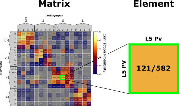
The Matrix Analyzer primarily displays the Synaptic Physiology Dataset as a matrix with presynaptic cell groups along the rows and postsynaptic cell groups along the columns. An element is a single pre-post pairing within the matrix. The Matrix Analyzer is built using Python and Pyqtgraph. Pyqtgraph has many functionalities and features, some of which are highlighted in the Appendix.
The Matrix Analyzer has three main panels:
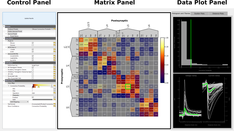
Control Panel
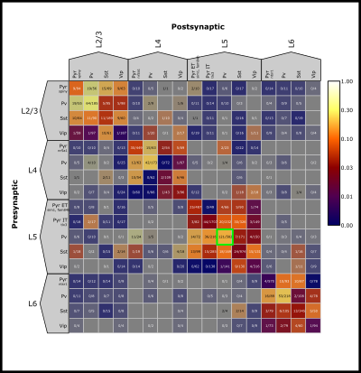
The Control Panel allows you to select the data to display in the matrix as well as how to filter and organize it. Presets are a good way to get started. By selecting one, the rest of the control panel will be populated. If anything in the control panel is changed, the Update Results button must be pressed to visualize the changes. Please be patient as it may take a minute for the data to load. As an example we will select the Mouse Connection Probability preset, this will display the connection probability for the full mouse matrix.
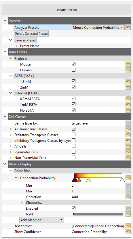
Data Filters Data Filters allow for filtering by organism and ion concentration in aCSF or internal solutions. By selecting a filter, you will reduce the dataset to only that which satisfies the filter. In this example we are filtering for Mouse projects and being inclusive to all aCSF calcium concentrations and internal EGTA concentrations.
Cell Classes Cell Classes determine the pre- and postsynaptic cell groups displayed in the matrix. Transgenic cell classes are most useful for mouse data while morphological cell classes are most useful for human data. A description of each Cell Class group can be found in the Appendix. A full definition of transgenic cell classes can be found on our webpage.
Matrix Display The Matrix Display, particularly the Color Map, determines which data will be included in the matrix and how it should be colorized. A color map can be added with Add Mapping. A map can be removed by right-clicking and selecting Remove Map. The example map here will show Connection Probability colored by a log scale with a min of 0 and max of 1. The min and max may also be edited.
Text Format is an editable field and determines the text displayed in each element. Any summary metric in the Add Mapping drop down is available to be formatted into text if placed within curly brackets. For decimal formats, standard Python string formatting may be used or selected preset formats including mV, μV, pA, ms, μs, mm, μm (ex. {PSP Amplitude.mV}).
By selecting a metric for Show Confidence, the color scale of the selected color map will be shaded by a confidence metric. The richer the color, the higher our confidence in the metric. When you have selected your favorite set of filters a custom preset can be saved by clicking on the > arrow by Preset name, entering a name for your preset and clicking Save Preset. If you use the same name as a preset that already exists it will overwrite. If you want to delete a preset, select it from the Preset menu and click Delete Selected Preset.
Matrix Panel
The Matrix Panel is the main display for summarizing synaptic physiology data in the form of a presynaptic (rows) –> postsynaptic (columns) matrix. The Matrix will always be organized first by layer and then by cell class based on the selection in the Control Panel.
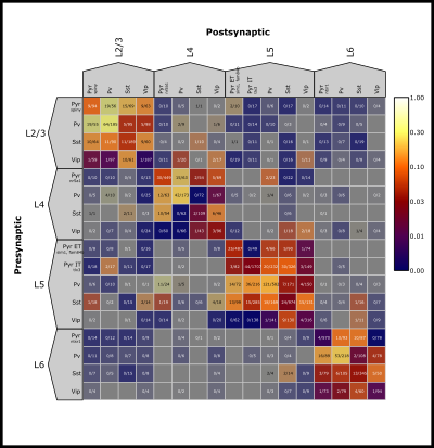
The color bar in the upper right corner shows the color scaling based on the selected Color Map and the min and max values. Multiple Color Maps may be present, but the color bar and Text Format will reflect the first Color Map that is “Enabled”.
The Matrix can zoom in or out by using the mouse scroll wheel or trackpad of your computer.
Elements within the Matrix are clickable. This will highlight that element with a unique colored border that is carried throughout the Data Plot Panel (see next section for more). Information about each pair in the selected element is printed in the console.
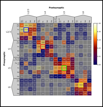
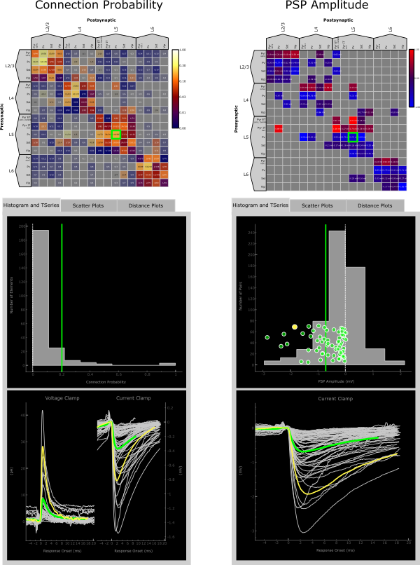
Up to six elements can be co-selected by holding the Ctrl key while selecting each element. Displays for each selected element will carry into the Data Plot Panel.
Data Plot Panel
The Data Plot Panel has 3 tabs: Histogram and TSeries, Scatter Plots, and Distance Plots. These tabs display more in depth data from the Matrix Display and are best used when selecting particular elements within the matrix. Element- and pair-wise data is consistently color coded through all of the displays with data from the entire matrix colored grey in the background as a reference.
Histogram and TSeries
The Histogram in the upper panel of this tab displays a histogram of the data displayed in the matrix. For metrics like Connection Probability the y-axis represents number of elements while for metrics like PSP Amplitude the y-axis represents the number of synaptically connected pairs. When an element is selected, a vertical line representing the value displayed in the matrix will be added on top of the histogram. For metrics such as PSP Amplitude that have a value for each pair within that element a scatter plot is also added (y-value is arbitrary).
The TSeries in the bottom panel displays average postsynaptic responses when an element is selected. Exactly what responses and their alignment is dependent on the metric displayed in the matrix. For example, Connection Probability shows both voltage and current clamp responses, while only current clamp is displayed when the matrix view is PSP Amplitude.
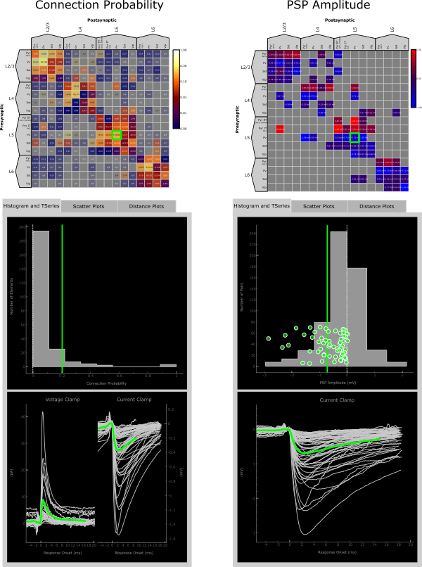
The Histogram and TSeries panels interact with one another and are themselves “clickable”. In the case where multiple TSeries views are displayed, clicking on and individual response in voltage clamp for instance will highlight the current clamp response from the same pair, if the data exists, and vice versa.
Similarly, if the Histogram panel displays a scatter plot, clicking on a point in the scatter plot will highlight the corresponding TSeries and vice versa.
In both cases, information about the selected pair is printed in the console.
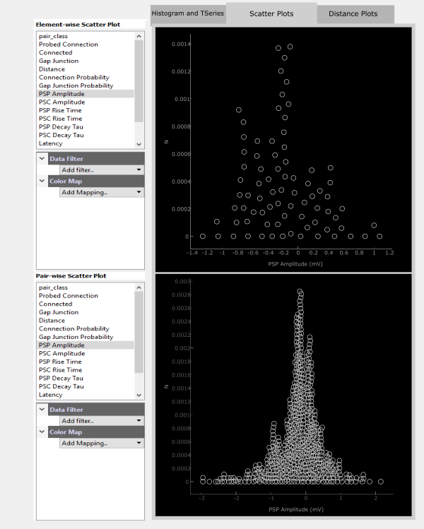
Scatter Plots
The Scatter Plot panel can operate somewhat independently from the Matrix Panel as well as the other tabs of the Data Plot Panel. Here, any data modality may be viewed as a scatter plot either in an Element-wise (upper panel) way or a Pair-wise (bottom panel) way.
For each panel, the top section lists the metrics available for plotting. Clicking on one, such as PSP Amplitude, will plot this metric along the x-axis with a pseudo-scatter along the y-axis.
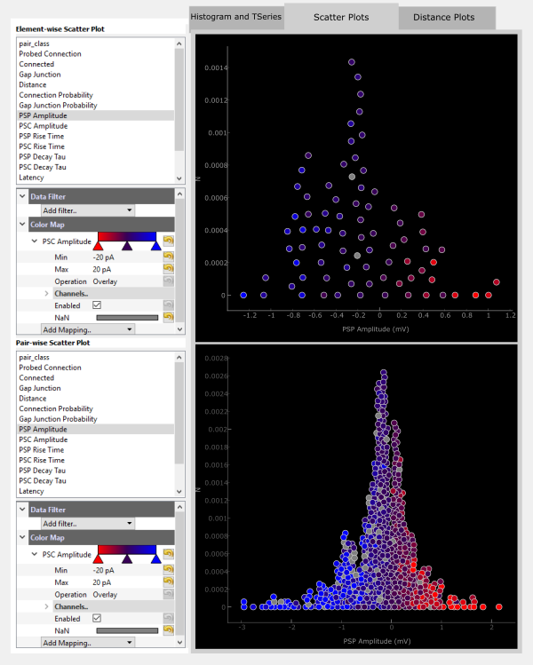
Filters and colorization can be added on top of the scatter plot. For example you could see how PSC Amplitude compares to PSP Ampltide by adding a ColorMap for PSC Amplitude. These color maps act the same as those for the Matrix Display.
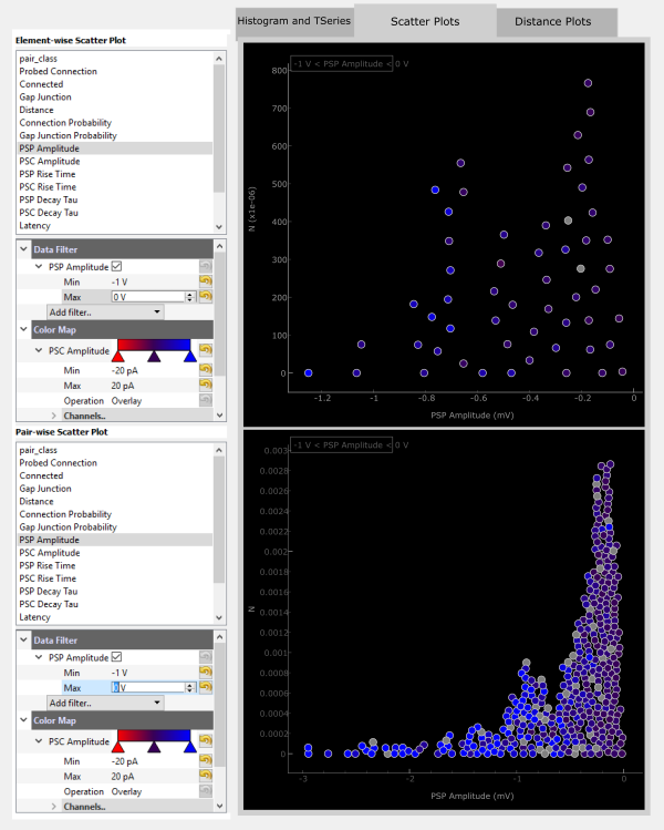
The displayed data can also be filtered by adding a Data Filter. For example, you can filter for only negatiave PSP Amplitudes.
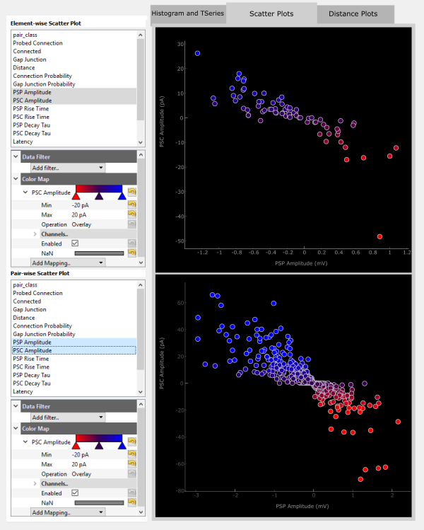
An easier way to visualize how PSP and PSC amplitude correspond may be to plot these against each other. Any two metrics can be plotted in this way by holding Ctrl while selecting the two metrics. The first selected metric will be plotted on the x-axis and the second along the y-axis.
The Scatter Plots interact with the Matrix Display in a similar way to the Histogram and TSeries. Clicking on an element will highlight that element in both scatter plot panels.
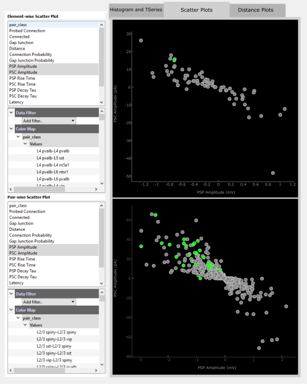
Additionally, individual points in each panel are clickable. More information about the selected element or pair is printed to the console.

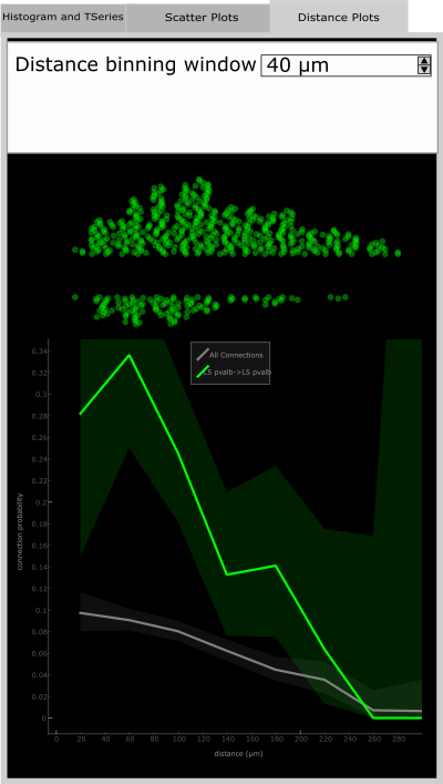
Distance Plot
The Distance Plot tab shows the relationship between connection probability and distance between the pre- and postsynaptic cells of a pair. The method for calculating this continuous relationship is described in Seeman, Campagnola, et al. eLife 2018.
The Distance Binning Window is an editable field in which you can vary the width of the window for which distance values are binned.
The scatter plot shows the distance for probed pairs in the upper part and connected pairs in the lower part. This is only shown when an element is selected and corresponds to the distance vs connection probability relationship shown in the plot below. The lighter background shade is the 95% confidence interval. The grey line is the distance vs connection probability for All Connection Classes in the Matrix.
Appendix
PyQtGraph
PyQtGraph is a graphical user interface that heavily utilizes the QtGui platform in particular the GraphicsView framework. With regards to the Matrix Analyzer interface pyqtgraph allows you to easily interact with plots. Below is a list of just a few of the main features built into pyqtgraph.
Axis Manipulation
All of the plot panels can be zoomed in and out with the mouse wheel, or by holding right-click and dragging the mouse to scale axes non-symmetrically
You can also hover over an individual axis and scroll up or down to expand or contract that axis
To return to autoscale, click the A in the bottom left corner
Context Menu
View All – autoscale’s axes
X/Y-Axis – set manual axis bounds, invert axis orientation
Plot Options – a variety of options to transform the plot display including transforming the x- and/or y-axis to a log scale, adding a grid, etc.
Export – copy or save the plot view as an image or SVG object
Data Filter Descriptions
Projects Projects are delineated by species, mouse or human. Selecting both, or neither, will have the same effect of showing data regardless of species
ACSF Multiple aCSF solutions were used in the experiments from which this data was collected. The primary difference was the calcium concentration which was either 2mM or 1.3 mM. A majority of the data was collected using a calcium concentration of 1.3mM. See Seeman, Campagnola, et al. eLife 2018 for a more in depth description and discussion on why these concentrations were chosen.
Internal Similar to aCSF, multiple pipette internal solutions were used in these experiments, the main difference being EGTA concentration. A majority of mouse data was collected using a concentration of 0.3mM EGTA while human data was collected using 0.3mM EGTA or No EGTA. See Seeman, Campagnola, et al. eLife 2018 for a more in depth description and discussion on why these concentrations were chosen.
Cell Classes
Define layer by: - The layer designation of a cell can be definied by the layer targeted during the experiment (target layer) or by the annotated layer from DAPI staining post hoc. See our webpage for more information about layer classification.
All Transgenic Classes – This class shows all of the transgenic classes organized by layer. Within each layer is 1-2 excitatory subclasses and the 3 major inhibitory subclasses, Pv, Sst, and Vip. It is best used with Mouse projects.
Excitatory Transgenic Classes – This class will show exclusively the excitatory transgenic subclasses. Because layer is a part of this class definition this matrix is also organized by layer. It can be combined with Inhibitory Transgenic Classes or Inhibitory Transgenic Classes by layer and is best used with Mouse projects.
Inhibitory Transgenic Classes by layer – This class will show all inhibitory subclasses combined and organized by layer.
Inhbitory Transgenic Classes - This class shows each inhibitory subclass collapsed across layers.
All Cells – This class will show all cells organized by layer. This matrix may be used with either Mouse or Human projects and is the best to view both projects simultaneously.
Pyramidal Cells – This class shows cells that were given a pyramidal morphology or spiny dendrite designation and is organized by layer. This is best used for Human projects, though can also be used for Mouse projects.
Non-Pyramidal Cells – This shows cells that were given a non-spiny dendrite designation and is organized by layer. It can be combined with Pyramidal Cells.